


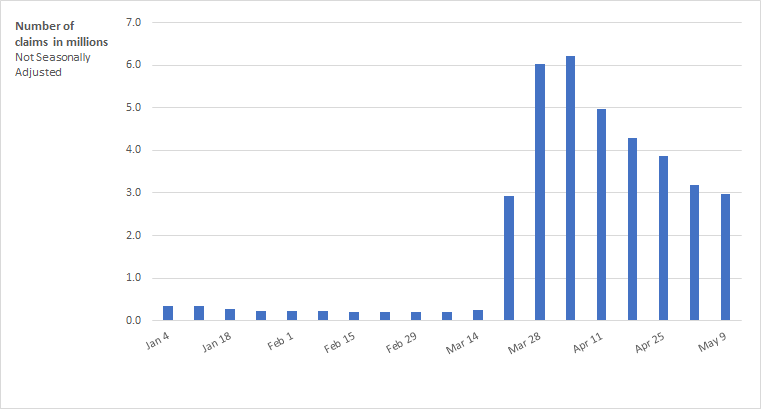
The COVID-19 pandemic continues to create an unprecedented effect on the economy, increasing unemployment to levels not seen since the Great Depression. Many jobs have been lost, and claims for unemployment insurance have surpassed by far the all-time high. In fact, as figure 1 shows, over the last seven weeks, more than 30 million Americans have filed for unemployment insurance, representing more than 20 percent of all employed workers.
Figure 1 — Initial claims filing for unemployment insurance for the U.S.
In light of this crisis, Congress quickly stepped in with support, spending nearly $3 trillion on a host of programs to provide public health and economic support at the onset of the pandemic. One of the first priorities of policymakers in this situation is to provide for workers who have lost their jobs and to make sure that those workers are able to meet their basic needs. In fact, one of the most economically important pieces of that policy support has been the rapid expansion of unemployment insurance (U.I.).
Thinking about how to design appropriate policies and determine which workers to target the aid towards, it is necessary to first understand which groups of the population are most vulnerable to this pandemic. In other words, should policymakers target specific sectors? Is either the output-share or employment-share of a sector in a state a good indicator of how the state is affected by the pandemic? Is it the case that specific demographic groups are more vulnerable to COVID-19?
To answer these questions, we investigate four sets of characteristics that can shed light on the groups of jobs and workers that have been most adversely affected by COVID-19. First, we look at the contributing share of sectors and industries to a state’s GDP. Second, we examine the importance of the employment share of different sectors at the state level. Third, we consider the demographic characteristics of a state’s employed population and, finally, the demographic characteristics of a state’s unemployed population.
In this descriptive analysis, we use weekly U.S. state-level data on initial unemployment claims, matched with state-level characteristics. We combine that data with state-level information on employed and unemployed workers, such as demographics and occupation as well as state-level GDP characteristics. We then divide U.S. states according to these characteristics and show the evolution of the average number of initial unemployment claims for these groups of states.
In a nutshell, we find that the contributing share of a vulnerable industry, like retail, to the output of a state, does not serve as a good indicator of how hard the state was hit by COVID-19-related job losses, neither is the employment-share of an industry in a state. The variables that seem to best predict the vulnerability of states are demographic characteristics of the population. More precisely, we find that minority groups, young workers, and those without private insurance and college education are more vulnerable to the adverse economic effects of the COVID-19 pandemic. Further, states with a large fraction of already unemployed female workers, people below age 35, and minority groups have also seen larger increases in new unemployment claims. These findings can help inform any future aid packages to states so that aid is targeted more narrowly towards those who need it most.
Is the share of different sectors contributing to state output a good indicator of vulnerability to job losses?
We start our analysis by splitting states according to how much GDP they derive from each of the following sectors: manufacturing, administration, healthcare, retail, accommodation, and construction. States that are in the upper 25th percentile of the distribution of each share are classified as “high GDP from sector,” and states that are in the lower 25th percentile are classified as “low GDP from sector.” We then calculate the average number of new claims filed in those two groups of states for each week over the last seven weeks (from March 7 to April 18). The results are shown in figure 2.
Figure 2 — Comparing the number of unemployment claims filed in states with high and low share of GDP coming from each sector

We then group states based on the sector with the largest contribution to the state’s GDP. Except for a handful of states, most states have either manufacturing or government as the sector with the largest share of GDP. In figure 3 we present the weekly average number of new unemployment claims for states which derive the largest share of their GDP from manufacturing versus those that do not (Panel A) and for states which derive a large share of their GDP from government versus those that do not (Panel B).
Figure 3 — Comparing unemployment claims filed in states based on the biggest contributor to GDP
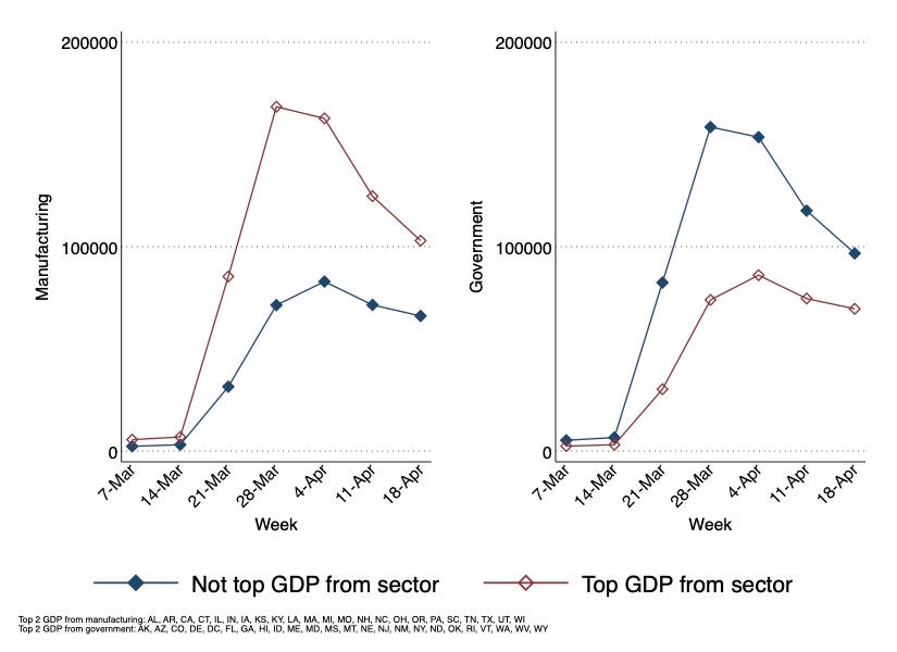
Looking at the data, it looks as if different sectors or industries show different degrees of vulnerability to job losses due to the crisis. In particular, figure 2 shows that states that derive a large fraction of their output from manufacturing have seen a large increase in initial unemployment claims relative to states where manufacturing does not matter as much. We observe a similar pattern for states which derive a large fraction of their output from administration. The results from figure 3 confirm this observation by showing that states reliant on manufacturing as the sector with the highest share of GDP have seen a substantial increase in initial claims relative to the states that do not have manufacturing as their highest GDP contributor. In turn, states that derive a lot of GDP from government jobs did not have a similarly significant spike both in figures 2 and 3. Further, states that derive a lot of output from healthcare, retail, and accommodation sectors did not see as large of an increase in the initial unemployment claims compared to states that do not derive as much output from those sectors. However, it is worth noting that for retail and accommodation, this pattern switched over time, suggesting that states reliant on retail and accommodation were hit with a delay.
These observations lead us to think that having a large share of GDP coming from a specific sector could be a relatively good indicator of the vulnerability of the state to the crisis. To verify this, we sort states according to the contributing share of each sector to their GDP. We did this sorting for three sectors that we find to be most relevant to the policy debate: manufacturing, retail, and administration. We compared the five states on the top of each list with the five states with the highest reported unemployment claims overall as well as the growth rate of reported unemployment claims. Except for one state (Arizona), there was no overlap between the two lists. In other words, the top 5 states with the highest output share in manufacturing are not the ones with the highest overall unemployment claims. And this is the case for retail and administration sectors as well. This suggests that GDP-shares of sectors in a state do not seem to predict how vulnerable the state is to job losses related to the pandemic.
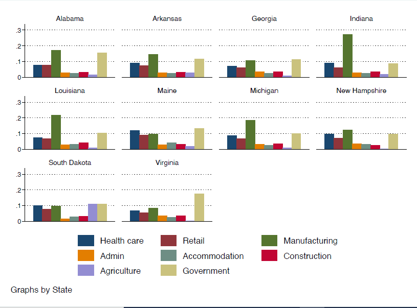
To investigate the potential reasons behind this inference, we look at the GDP-shares of sectors at the state level for the states with the highest reported growth in unemployment claims. Using data on the total number of unemployment claims, we picked the top 10 states in terms of growth of initial unemployment claims between March 14 and April 4 (which was the peak of unemployment claims filed over a one-week period). For each of those states, we can plot what percentage of state GDP is coming from each sector.
As we can see in figure 4, GDP-shares of all sectors except for manufacturing and government are fairly similar across these ten states. But for manufacturing, and government, the variance is higher. This suggests that the GDP-share of sectors does not vary enough for us to be able to create a meaningful distinction among states. Therefore, the biggest sector in terms of output share is not a good indicator of how the state labor market will be affected by COVID-19.
Another potential reason that industry alone does not predict the impact of COVID-19 on a state’s job losses is that there are many different occupations in each sector. Manufacturing, for example, includes both production workers and engineers; even food services includes both low-paid servers and higher-paid operations managers. And due to the nature of the crisis, the type of work someone does and the occupation rather than the sector is more relevant for providing insight into who is the most vulnerable worker in this crisis. For example, a server is much more likely to lose a job compared to a manager even though they both work in the same industry. Ideally, we would want to repeat this exercise for occupation groups instead of sectors. However, states do not report their unemployment claims by occupation.
Figure 4 — Comparison of output share of sectors among the ten states with the highest growth of reported unemployment claims between March 14 and April 4
Is the employment share of each sector in a state a good indicator of state vulnerability?
We repeat the previous exercise using the employment share of each sector instead of the output share, and we obtain similar results that are shown in figure 5. Again, states with more people employed in manufacturing and administration have seen the largest increase in new unemployment claims relative to states that do not have as many people employed in either of those sectors. However, states with the highest share of employment in manufacturing or administration are not the ones with the highest total unemployment claims. Notice that states with a large fraction of workers employed in the government sector have seen a relatively smaller increase in the initial unemployment claims.
Figure 5 — Comparing the number of initial unemployment claims filed in states with a high and a low share of employment in each sector
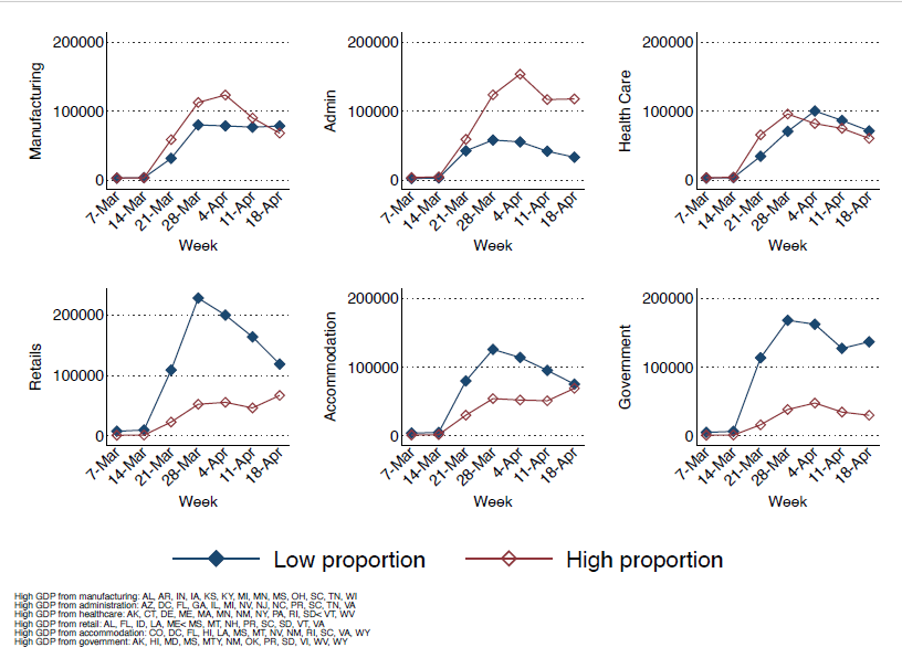
Of course, the share of people employed in a given sector is highly correlated with the share of GDP derived from that sector for each state. In fact, the correlation is 90% for manufacturing. This means that states with the highest employment share in a specific sector usually receive the biggest share of output from the same sector. Therefore, similar to the previous exercise, comparing the states with the highest share of employment in these sectors and states with the highest reported unemployment claims shows that a sector’s employment share does not have a predicting power on vulnerability of the state either. And this is again because of the fact that employment shares of sectors do not vary much across states, and they do not create a meaningful distinction between states.
Do demographic characteristics of a state matter?
Another question is whether state-level demographic characteristics could be determinants of how a state is affected by COVID-19. Usually, people who are employed in a certain occupation share a set of characteristics. For example, high-paid administrative jobs usually require a college degree. Hence, by looking at the portion of the population with a specific demographic characteristic, we are, indirectly, looking at the employment share for a group of occupations, which in principle could be more or less vulnerable to the pandemic.
Figure 6 — Comparison of reported initial claims across states based on percentage of their employed workers with each characteristic
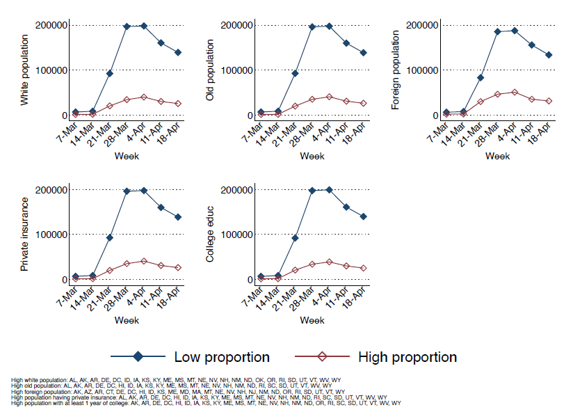
We studied the following demographic groups: white population, older population (more than 65 years old), foreign-born population, people with private health insurance, and people with at least some college education. We categorized states based on the percentage of their working population with each of those demographic characteristics. A state for which the percentage of the employed population with any of those characteristics is above the median across all states is called “high proportion.” Figure 6 compares the initial claims reported in states with five demographic characteristics for which there is a significant difference between high-proportion and low-proportion states. We find that states with a higher share of the population that is: white, old, foreign-born, college-educated, and has private insurance have seen a lower increase in the weekly number of initial unemployment claims. These results are in line with the evidence on the effects of social distancing policies in the U.S. by Mongey et al. (2020) and with evidence on the effects of COVID-19 on labor markets from Norway by Alstadsæter et al. (2020). Mongey et al. (2020) argue that states with a high proportion of non-white, young, non-foreign, non-insured, and non-college educated people have seen a much larger increase in new unemployment claims than other states. It is important to note that even when we consider the share of GDP that each state derives from manufacturing, government, and other sectors, the demographic characteristics of states remain important determinants of the differences in the number of unemployment claims.
This finding suggests that unlike the output-share and employment-share of sectors, which do not have significant predictive power, the demographic characteristics of the employed population of a state can provide important insights into the vulnerability of the state to the pandemic’s effects on jobs.
Do demographic characteristics of the state’s unemployed population matter?
Finally, we consider the characteristics of the unemployed population in each state. The idea is to identify the demographic specifications of the already vulnerable population in a state and to study which of those descriptive features could be a determining factor of how the state is affected by the pandemic.
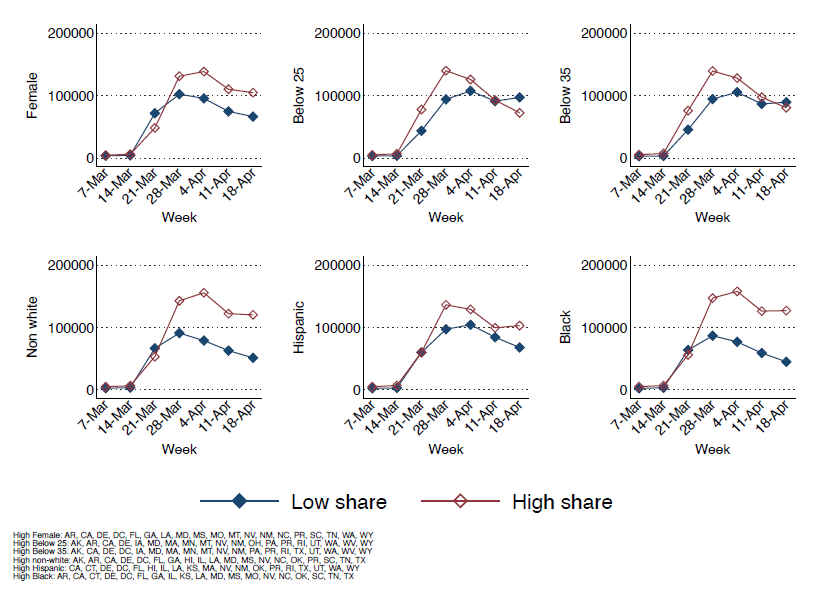
To do this, we consider various demographic features and group states by having either a high or low proportion of each of those characteristics. A state for which the percentage of the unemployed population with each characteristic is above the median is called “high proportion.” Figure 7 compares the initial claims reported in states with five demographic characteristics of the unemployed population for which there is a significant difference between high-proportion and low-proportion states.
We find that states where the unemployed population is largely female, young (both below 25 and below 35), and non-white (in particular black and Hispanic), have seen a much higher increase in the number of initial unemployment claims compared to other states. These results suggest that in states with an already vulnerable population of workers who are female, young, and minorities, the effect of COVID-19 on unemployment was stronger. These characteristics are often associated with lower-paid jobs and strongly correlate with the occupation characteristics of the most vulnerable workers.
Figure 7 — Comparison of reported initial claims across states based on percentage on their already unemployed workers with each characteristic
What can we learn about the public policy response to pandemic-related job loss?
After analyzing a set of characteristics which have the potential to provide insight into the vulnerability of states to COVID-19, we find that unlike what we usually hear in the media about the impacts of large sectors being affected by the pandemic, having a larger GDP-share or employment-share in a vulnerable sector, like retail, does not necessarily mean that the state is more vulnerable compared to others.
Based on our results, a set of demographic characteristics that identify a subpopulation offers more predictive power regarding the vulnerability of a state to COVID-19-related job losses. We find that states with lower shares of white, old, foreign-born, and college-educated workers with private health insurance are more vulnerable to the adverse effects of the COVID-19 pandemic. Likewise, we also find that states in which female, young, and minority workers make up a larger share of the unemployed population experience a larger increase in initial unemployment claims.
These results suggest that certain population groups are more likely to be adversely affected by the economic effects of the crisis. The subpopulation that is defined based on these demographic characteristics is more likely to earn a lower income. We often think of low paid jobs as being associated with non-college educated, young, minority uninsured workers. These characteristics are not necessarily related to a type of occupation but are likely more prevalent in retail jobs.
COVID-19 has also resulted in many people having to stay at home to take care of their children. Low-cost childcare options are no longer available to large groups of the population in many areas. This is because schools, kindergartens, and nurseries have been forced to shut down by government mandates. This has resulted in some low-income workers not being able to afford childcare. We identify that states with a large portion of female, young, and minority workers who are already unemployed are more vulnerable to the adverse effects of COVID-19. These people may also be providing childcare in their households. This makes them even more vulnerable to the effects of COVID-19, especially in terms of their future labor market outcomes.
All of this suggests that policymakers should, in fact, structure future aid packages to be more directed towards this subpopulation. One potential way to do this is to make the next round of the stimulus checks more progressive. Instead of defining a cutoff at $75,000 annual income for an individual or $150,000 for a couple as the eligibility threshold for receiving the federal transfer, policymakers could offer a larger amount, but only to lower-income groups who are more likely to have lost their jobs, and also more likely to be short on savings. They could then decrease the transfer value as income level increases. Making future aid packages more targeted based on demographics rather than industry will help get aid to those who need it most.
Endnotes
1 We used Department of Labor data for unemployment claims and characteristics of unemployed workers at the state level; https://oui.doleta.gov/unemploy/. The data on output-shares of sectors at the state level is from NIPA; (https://www.bea.gov/). Employment-share of sectors at the state level is from Bureau of Labor Statistics; https://www.bls.gov/. And demographic characteristics of the employed population is from IPUMS USA, University of Minnesota, https://usa.ipums.org/; data for unemployment claims by sectors are available for 15 states; https://economic.github.io/ui_state_detailed/
2 To the best of our knowledge, Minnesota is the only state that provides data on initial claims by occupation on the weekly report. https://sites.google.com/view/covidinequality/ show some results using information on occupation for employed workers.